

How Colors Can Alter the Mood of Artwork
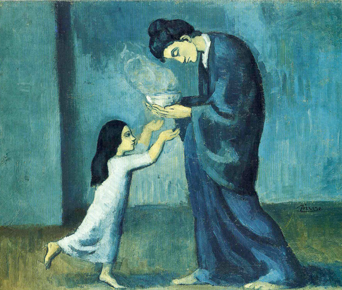
For centuries, artists have used color to create atmosphere, draw attention to certain areas, and help communicate emotion.
And, while everyone responds to color a little differently, certain color relationships tend to create recognizable moods.
Warm colors such as red, orange, and yellow are often associated with energy, warmth, excitement, and movement.
A sunset filled with oranges and reds may feel cozy or dramatic, while those same colors used more intensely can create a sense of urgency or tension.
Cool colors like blue, green, and violet often create a calmer or more peaceful feeling.
Blues can suggest quiet, distance, or even sadness, while greens are frequently associated with nature, balance, and relaxation. Artists can also mix warm and cool colors within the same painting to create contrast and guide the viewer’s eye.
Brightness and saturation matter too. Highly saturated colors tend to feel bold, lively, and energetic, while muted or desaturated colors can create a softer, more nostalgic, or subdued mood. Value (the lightness or darkness of a color) also plays an important role. Darker palettes can feel mysterious or dramatic, while lighter palettes often feel open, cheerful, or airy.
Some of the world’s most recognizable artists understood that color could do far more than simply describe what something looked like.
These artists approached color very differently, but each showed how strongly a palette can influence the emotional experience of a painting... even before we fully understand what we are looking at.
** Vincent van Gogh used intense blues, glowing yellows, and swirling contrasts in The Starry Night to turn an ordinary nighttime landscape into something emotional, restless, and almost dreamlike.
** Pablo Picasso famously relied on cool blues and blue-greens during his Blue Period; paintings such as The Old Guitarist feel somber, lonely, and reflective largely because of their limited, muted palette.
---> More about Picasso's "blue period" (including the painting shown above), linked below!
** Henri Matisse took nearly the opposite approach in works like The Red Room, filling the canvas with rich, saturated red to create an atmosphere that feels warm, energetic, and immersive.
** Claude Monet also used color to shape feeling in his Water Lilies paintings, layering soft blues, greens, pinks, and violets to create a peaceful, meditative quality rather than simply documenting the appearance of a pond.
The meaning of color isn’t completely universal. Culture, personal experience, surrounding colors, and the subject of the painting can all influence how a viewer interprets a particular shade. That flexibility is part of what makes experimenting with color so interesting.
At Pinot’s Palette, you don’t have to be an experienced artist to explore how color changes a painting. During a painting class, you can follow along with the featured design or make it your own by adjusting colors to match your personality, décor, or mood. Sometimes simply changing the palette can give the same painting an entirely different feeling.
Share Come Paint With Us! | All About Picasso's 'Blue Period'