Basic Colour Theory, part 2
Knowing how to match colorus for pleasing effect is definitely important, but why? It turns out that people react very keenly to colours, letting them influence mood, their surroundings and even what we buy. The study of this is known as colour psychology.

It's very important to note that, just as many cultures have different names for or even total number of colours, different cultures react to colours differently than Western societies. For example, we tend to associate blue with 'good' things (like Heaven or calmness) and red with 'bad' (like Hell or anger). However, the exact opposite holds true in Japan, where red is used in Kabuki shows to signify which actor is the hero and blue is used for villains.
However, it's true we can separate colours into warm and cool hues. Red, orange and yellow have longer wavelengths of light and are considered 'warm' colours. These are the selfsame colours you'll see in a fire, or to detect heat in night vision goggles. Green, blue and violet are much shorter frequency shades and are 'cool' colours. You can find these in ice or the night sky.
Emotions are very physical things. When we get angry, we may get flushed or sweat. We feel warm. It's easy to see how red can be associate with aggression or passion, then. Likewise, we might feel calmer in nature, so green can invoke that same emotion with when we see it in a painting.
But how does this sway people to buy certain products or eat less?
Most of us are very visual. A study by by the secretariat of the Seoul International Color Expo found that 92.6% of respondents reported the visuals of an item played the largest role in determining whether or not they bought an item. Comparatively, only 5.6 percent said that the physical feel via the sense of touch was most important. Hearing and smell each drew 0.9 percent. Other studies show people tend to decide whether they'll buy a product within a scant 90 seconds of seeing it. This means packaging really does matter for products!
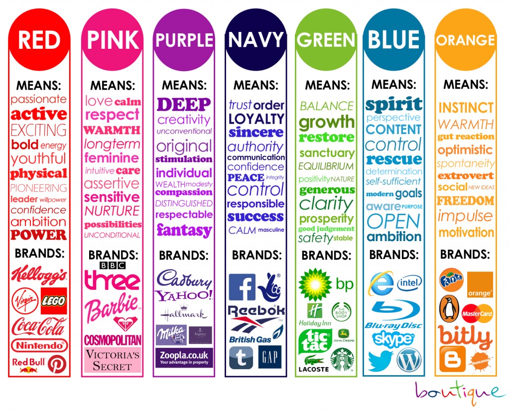
It also helps with brand recognition. Some colours have become synonymous with their brand. Coca-cola is red, Pepsi is blue. Starbucks is green, Dunkin is orange and pink. Firefox is orange, Internet Explorer is trash. See? Colour is everything!
Red has been shown to stimulate the salivary glands and signal the brain to increase appetite, while yellow is the first colour eyes perceive. Does the McDonald's logo make more sense? Green is associated with freshness and health, as well as responsibility and reliability. Starbucks and Wholefoods come to mind. Cool colours tend to dampen appetite, which is why you may not find many fast food establishments using that in the branding.
A lot of research continues to be done on how colour effects the brain, and while it really comes down to the individual, the paints you chose to bring your artistic vision to life can greatly influence how others view the end result!
(Images from visme.co and blog.hubspot.com )

