Decorating With The Pantone Color(s) Of The Year!

It’s been proven that certain colors relate to certain moods and feelings.
Yellow for a cheerfulness; Blue to soothe and calm; Red for a dramatic touch (and so on…).
The biggest color matching system in the interior design and home trend industry is none other than ‘Pantone’.
Every year on the first days of December, The Pantone Color Institute announces the new Color of the Year. It has been said to be the best part of the year for anyone who works with color.
The Pantone Color System is the most important color matching system in the world. The system originated in 1963 to solve the problem of complicated color matching in the printing industry.
Soon after, Pantone became the easiest and simplest way to classify, communicate and match colors with the use of a color catalog in a fan format.
Every color, in every tone and tint, was given a number to classify it. Pantone literally wrote the book on color matching. For over 40 years, Pantone has been the go-to color matching system for not only the design industry but also paint, textile and plastic manufacturers.
*** INTRODUCING: THE PANTONE COLOR OF THE YEAR 2021
PANTONE 17-5104 Ultimate Gray + PANTONE 13-0647 Illuminating
This is a marriage of color conveying a message of strength and hopefulness that is both enduring and uplifting.
PANTONE 17-5104 Ultimate Gray + PANTONE 13-0647 Illuminating, two independent colors that highlight how different elements come together to support one another, best express the mood for Pantone Color of the Year 2021. Practical and rock solid but at the same time warming and optimistic, the union of PANTONE 17-5104 Ultimate Gray + PANTONE 13-0647 Illuminating is one of strength and positivity. It is a story of color that encapsulates deeper feelings of thoughtfulness with the promise of something sunny and friendly.
A message of happiness supported by fortitude, the combination of PANTONE 17-5104 Ultimate Gray + PANTONE 13-0647 Illuminating is aspirational and gives us hope. We need to feel that everything is going to get brighter – this is essential to the human spirit.
As people look for ways to fortify themselves with energy, clarity, and hope to overcome the continuing uncertainty, spirited and emboldening shades satisfy our quest for vitality. PANTONE 13-0647 Illuminating is a bright and cheerful yellow sparkling with vivacity, a warming yellow shade imbued with solar power. PANTONE 17-5104 Ultimate Gray is emblematic of solid and dependable elements which are everlasting and provide a firm foundation. The colors of pebbles on the beach and natural elements whose weathered appearance highlights an ability to stand the test of time, Ultimate Gray quietly assures, encouraging feelings of composure, steadiness and resilience.
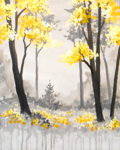
One Of Our Most Original & Popular Paintings Is ‘ Forêt Noir et Jaune’ (shown above)
A lovely french grey forest with bright yellow accents that uses a variety of paint techniques for a lively paint session.
Our customers LOVE this painting so much, and it’s for the stunning combination of colors
You can click below to order the materials and pre-recorded video instructions and materials to paint this masterpiece from your own home!
https://www....outhhill/shop
Artwork that will add these colors to your home OR that will work GREAT with these colors already in your living space!
March 18th - Sunset On The Dunes
Join us to paint this beautiful, dramatic sunset on the dunes.
https://www..../event/522907
(*Virtual): https://www..../event/524064
March 20th - Shimmering Cherry Blossoms
In this Asian painting the fog creates an ethereal feel and the vibrant cherry blossoms bring warmth and happiness.
https://www..../event/522889
(*Virtual): https://www..../event/524077
March 23rd - Golden Gaze
This watercolor-esque rendering of a barn owl is both expressive and easy to customize.
https://www..../event/522909
(*Virtual): https://www....op-item/32951
March 26th - Misty Woodlands
A serene rainbow forest full of magic and wonders!
https://www..../event/522912
(*Virtual): https://www..../event/524069
March 27th - Lilacs In A Vase
Inspired by Manet’s painting, this bouquet of purple lilacs can add a soft touch of color to any space.
https://www..../event/522934
March 31st - Swirling Forest
https://www..../event/522914
While There Are Tons Of Paitnings That Look Great With Yellow And Grey Decor (Reds And Blues Looks Lovely With Them), ANY Of The Painting In Our Library Can Be Altered To Fit YOUR Style!

