The New Fall Color Palette
If you’re trying to decide what color scheme to use for your new fall style, keep reading! Pinot’s Palette is bringing you Pantone’s Color Report for Fall 2016.

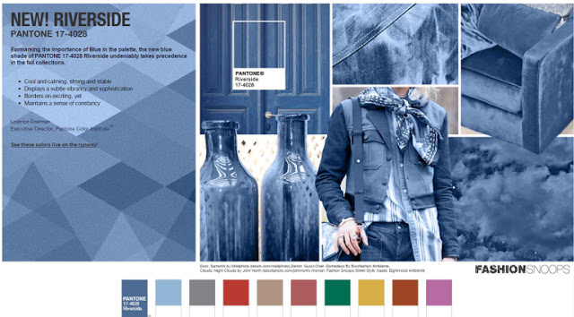
For fall of 2016 Pantone has put together a gorgeous color palette inspired full of vibrant blues, solid earth tones, and pops of lush grays, red, pinks and yellows. The colors include Riverside, Airy Blue, Sharkskin, Aurora Red, Warm Taupe, Dusty Cedar, Lush Meadow, Spicy Mustard, Potter’s Clay, and Bodacious.
These colors combine in a truly unique and striking way! Whether you’re re-painting your house, looking for new bedding, or even doing a little clothes shopping, you can’t go wrong following this lead. Pantone calls them “A Unity of Strength, Confidence and Complexity” and it’s easy to see those traits in this palette.
You can go to the Pantone website here for more detail about these beautiful colors. Hopefully you can find a way to incorporate at least a few of these into your fall style!

